.svg)
Mobile App Customization
iOS
The ChartIQ iOS app is located in the Demo folder of the ChartIQ-iOS-SDK GitHub repository.
You can easily customize the app to create your own iOS charting application.
Color extensions
To edit the iOS app colors, open the UIColor+Extensions.swift file in the Demo/ChartIQApp/Extensions folder of your copy of the project.
The file contains UIColor extensions that define:
- App colors
- Theme colors
- Color picker colors
App colors
The first UIColor extension in UIColor+Extensions.swift defines the static colors used in the application.
extension UIColor {
  internal static let whiteColor = UIColor(hexString: "ffffff")
  internal static let blackColor = UIColor(hexString: "000000")
  internal static let ghostWhiteColor = UIColor(hexString: "f9f9f9")
  internal static let brightGreyColor = UIColor(hexString: "ebeff3")
  internal static let cadetBlueColor = UIColor(hexString: "abb0ba")
  internal static let mountainMeadowColor = UIColor(hexString: "27cc8d")
  internal static let darkElectricBlueColor = UIColor(hexString: "53627C")
  internal static let gainsboroColor = UIColor(hexString: "dadfe3")
  internal static let darkGunmetalColor = UIColor(hexString: "18252e")
  internal static let chineseBlackColor = UIColor(hexString: "091924")
  internal static let yankeesBlueColor = UIColor(hexString: "153246")
  internal static let coralRedColor = UIColor(hexString: "ff3b30")
  internal static let brillianteAzureColor = UIColor(hexString: "3a8eff")
  internal static let outerSpace = UIColor(hexString: "273843")
  internal static let charlestonGreen = UIColor(hexString: "1F2A34")
}
All colors have unique names, most of which are used in the theme color combinations.
Theme colors
The second UIColor extension defines color combinations that support light and dark themes in the application.
extension UIColor {

  internal class var whiteDarkGunmetalColor: UIColor {
    return colorAsset(name: "whiteDarkGunmetal", baseColor: UIColor.whiteColor)
  }

  internal class var whiteCharlestonGreenColor: UIColor {
    return colorAsset(name: "whiteCharlestonGreen", baseColor: UIColor.whiteColor)
  }

  internal class var whiteYankeesBlueColor: UIColor {
    return colorAsset(name: "whiteYankeesBlue", baseColor: UIColor.whiteColor)
  }

  internal class var ghostWhiteСhineseBlackColor: UIColor {
    return colorAsset(name: "ghostWhiteСhineseBlack", baseColor: UIColor.ghostWhiteColor)
  }

  internal class var brightGreyYankeesBlueColor: UIColor {
    return colorAsset(name: "brightGreyYankeesBlue", baseColor: UIColor.brightGreyColor)
  }

  internal class var darkElectricBlueWhiteColor: UIColor {
    return colorAsset(name: "darkElectricBlueWhite", baseColor: UIColor.darkElectricBlueColor)
  }

  internal class var darkElectricBlueCadetBlueColor: UIColor {
    return colorAsset(name: "darkElectricBlueCadetBlue", baseColor: UIColor.darkElectricBlueColor)
  }

  internal class var gainsboroDarkElectricBlueColor: UIColor {
    return colorAsset(name: "gainsboroDarkElectricBlue", baseColor: UIColor.gainsboroColor)
  }

  internal class var gainsboroDarkYankeesBlueColor: UIColor {
    return colorAsset(name: "gainsboroDarkYankeesBlue", baseColor: UIColor.gainsboroColor)
  }

  internal class var yankeesBlueMayaBlueColor: UIColor {
    return colorAsset(name: "yankeesBlueMayaBlue", baseColor: UIColor.yankeesBlueColor)
  }

}
Color combinations load color assets so that they can be used in the code. Color assets are named according to the form <color in light theme><color in dark theme>. For example, whiteDarkGunmetal — "white" is the color in the light theme, and "DarkGunmetal" is the color in the dark theme.
The baseColor parameter is the light theme color for the combination, which is required for versions of iOS that do not support Dark Mode.
Color picker colors
The third UIColor extension in UIColor+Extensions.swift defines a set of colors for color pickers in the application.
extension UIColor {

  internal static func allColors() -> [UIColor] {
    return [
      UIColor(hexString: "960616"),
      UIColor(hexString: "ea1d2c"),
      UIColor(hexString: "ef6c53"),
      UIColor(hexString: "e4977c"),
      UIColor(hexString: "ffffff"),
      UIColor(hexString: "a16118"),
      UIColor(hexString: "f4932f"),
      UIColor(hexString: "f8ae63"),
      UIColor(hexString: "fbc58d"),
      UIColor(hexString: "cccccc"),
      UIColor(hexString: "cbb920"),
      UIColor(hexString: "fff126"),
      UIColor(hexString: "fff371"),
      UIColor(hexString: "fff69e"),
      UIColor(hexString: "b7b7b7"),
      UIColor(hexString: "007238"),
      UIColor(hexString: "00a553"),
      UIColor(hexString: "43b77a"),
      UIColor(hexString: "85c99e"),
      UIColor(hexString: "898989"),
      UIColor(hexString: "00746a"),
      UIColor(hexString: "00a99c"),
      UIColor(hexString: "2ebbb3"),
      UIColor(hexString: "7fcdc7"),
      UIColor(hexString: "707070"),
      UIColor(hexString: "004c7f"),
      UIColor(hexString: "0073ba"),
      UIColor(hexString: "4a8dc8"),
      UIColor(hexString: "7DA6F5"),
      UIColor(hexString: "555555"),
      UIColor(hexString: "62095f"),
      UIColor(hexString: "912a8e"),
      UIColor(hexString: "a665a7"),
      UIColor(hexString: "bb8dbe"),
      UIColor(hexString: "1d1d1d"),
      UIColor(hexString: "9c005d"),
      UIColor(hexString: "e9088c"),
      UIColor(hexString: "ee6fa9"),
      UIColor(hexString: "f29bc1"),
      UIColor(hexString: "000000")
    ]
  }
}
You can modify the color picker by adding, editing, or removing array elements.
Color sets
To change the app color combinations to support light and dark themes, you must revise the color sets in the Demo/ChartIQApp/Resources/Assets.xcassets/Colours folder.
The color set folders have the same names as the colors in the theme color extension, which loads the color sets for use in the application.
The folders contain JSON files that define the theme colors. The JSON object in each file contains a property named colors that has an array value. The array contains two elements, each of which is an object. The first array element defines the color of the light theme and the second array defines the color of the dark theme. Changing the colors in these color combinations, changes all elements using these combinations in the demo app.
For example, here is the Contents.json file from the whiteDarkGunmetal.colorset folder:
{
  "colors" : [
    {
      "color" : {
        "color-space" : "srgb",
        "components" : {
          "alpha" : "1.000",
          "blue" : "1.000",
          "green" : "1.000",
          "red" : "1.000"
        }
      },
      "idiom" : "universal"
    },
    {
      "appearances" : [
        {
          "appearance" : "luminosity",
          "value" : "dark"
        }
      ],
      "color" : {
        "color-space" : "srgb",
        "components" : {
          "alpha" : "1.000",
          "blue" : "0.180",
          "green" : "0.145",
          "red" : "0.094"
        }
      },
      "idiom" : "universal"
    }
  ],
  "info" : {
    "author" : "xcode",
    "version" : 1
  }
}
To modify the theme colors, change the values of the red, green, blue, and alpha properties of the components property of the color object.
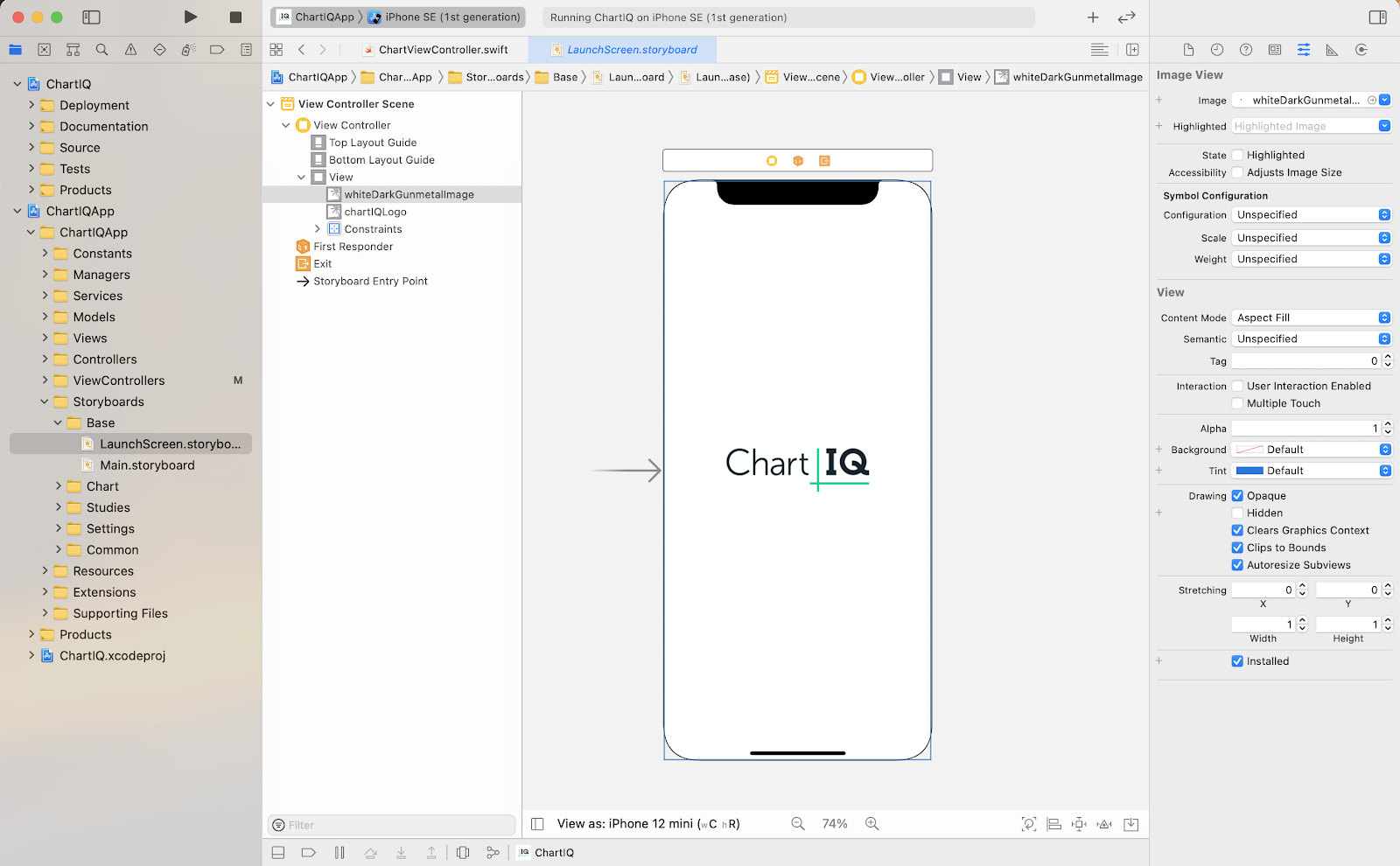
Launch screen
The app launch screen (or splash screen) is a static screen that cannot be changed from the code and is completely laid out in the storyboard. It is defined in the LaunchScreen.storyboard XML file in the Demo/ChartIQApp/Storyboards/Base/Base.Iproj folder.
You can customize the launch screen in the Xcode storyboard editor. Use the editor to add, edit, and remove launch screen colors, logos, text, and images.
Demo app navigation
The ChartIQ project contains two demo applications that differ only by navigation and main screen UI. Both offer the same functionality, but with a different UI for displaying the components that enable chart interaction as follows:
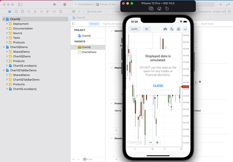
- ChartIQDemo — single page UI that does not include bottom native tab bar, and all necessary components of the chart are gathered on the single screen.
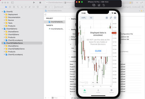
- ChartIQTabBarDemo — UI that contains the bottom native tab bar that is responsible for transitions between the main sections of the application. The native tab is no longer being updated as of ChartIQ version 8.8.0.
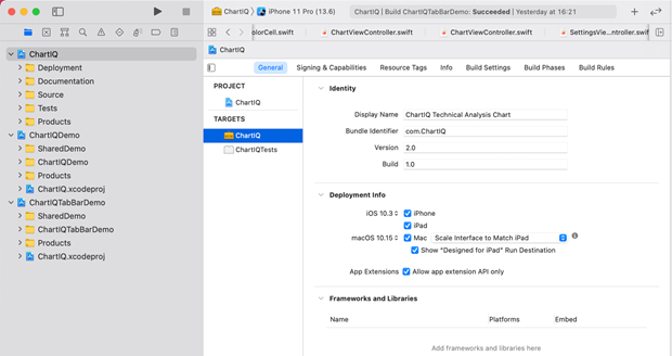
For project architecture, we have one unified workspace (ChartIQ.xcworkspace)that contains three projects: ChartIQ SDK (ChartIQ), ChartIQ demo application with custom navigation (ChartIQDemo), and a ChartIQ demo application with a native tab bar as the main component for navigation (ChartIQTabBarDemo). This workspace offers a convenient workspace to simultaneously work with three projects.
NOTE: As of ChartIQ version 8.8.0, only the ChartIQDemo will be updated with the latest ChartIQ features.
Running demo apps
To launch a demo application with custom navigation, go to the list of schemes and then select the desired demo application in the drop-down menu.
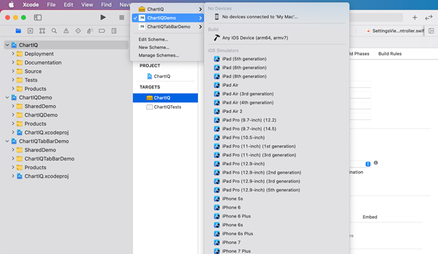
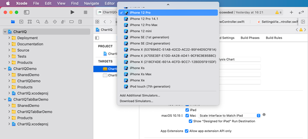
Next, in the adjacent drop-down menu, select whether the demo application will be launched on one of the simulators or on a connected device, and then press the Play button to build the project and run it on the selected device.
As a result, you will see the loaded simulator with the selected demo application running in it with custom navigation.
In order to launch the demo application with the native version, follow similar steps, select ChartIQTabBarDemo, and then press the Play button. As a result, you will see a Demo application with a native tab bar loaded in the simulator.
Note that it is not necessary to choose different simulators and devices to run different demo applications. When you launch a new demo application on an already selected simulator, installs a new demo instead of the old one.
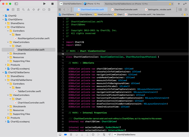
Demo app file structure
In both demo application projects, the structure of the code, folders, and files are identical. For convenience and correct linking, all common classes are in a folder SharedDemo, which is connected it to both demo applications. Further, in the demo applications themselves, there were files and classes that differ. In ChartIQDemo we have a custom RootNavigationController as navigation, and in ChartIQTabBarDemo a native TabBarController. Like navigation, there are also differences in the main chart screen, so we have two ChartControllers, one for each demo application.
Next steps
- See the UIColor API documentation